Landing Page Components 29 Essential Sections ✨
Discover the key sections, components, and optimal techniques for developing effective landing pages that generate high conversions.

Hero
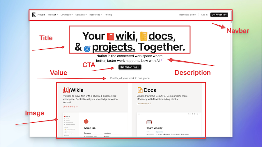
The first big section on a website that tells you what the site is about, like the cover of a book.
Tips
Useful tips to improve the quality of your landing page.
- Keep the messaging clear and concise, avoiding jargon or complex language
Should I add a Hero section?
Yes, you should definetely include it if you are building a landing page
Hero Section Examples
Notion
-
Notion Hero Component & Section
Notion landing page example


Problem
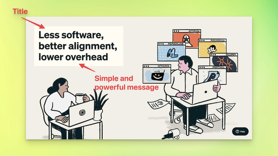
The part of a website that talks about a problem or difficulty that people might have, which the company's product or service can solve.
Tips
Useful tips to improve the quality of your landing page.
- Use real-life examples or testimonials to make the problem relatable and demonstrate how your offering can be the solution
Should I add a Problem section?
It's optional. You may include it if you are building a landing page for a SaaS business.
Problem Section Examples
Outseta
-
Outseta Hero Component & Section
Outseta landing page example

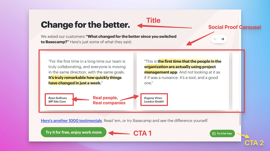
Social Proof
This is where people who've used the product or service say how great it was for them.
Tips
Useful tips to improve the quality of your landing page.
- Use authentic customer photos and names (with permission) to increase credibility and trustworthiness.
Should I add a Social Proof section?
Yes, you should include it if you are building a landing page
Social Proof Section Examples
Basecamp
-
Basecamp Hero Component & Section
Basecamp landing page example

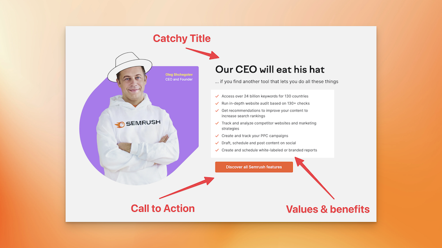
Value & Product
This is the part of a website that tells you what you'll get or how you'll benefit from using the product or service.
Tips
Useful tips to improve the quality of your landing page.
- Clearly outline the unique selling points of your product or service, emphasizing the benefits it provides
Should I add a Value & Product section?
Yes, you should include it if you are building a landing page
Value & Product Section Examples
Semrush
-
Semrush Hero Component & Section
Semrush landing page example


Logo Cloud
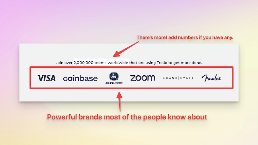
A collection of logos that show other companies or people who use or support the product or service.
Tips
Useful tips to improve the quality of your landing page.
- Ensure the logos are of good quality and represent well-known and reputable brands or partners.
Should I add a Logo Cloud section?
Logo Cloud Component
Logo Cloud Section Examples
Trello
-
Trello Hero Component & Section
Trello landing page example

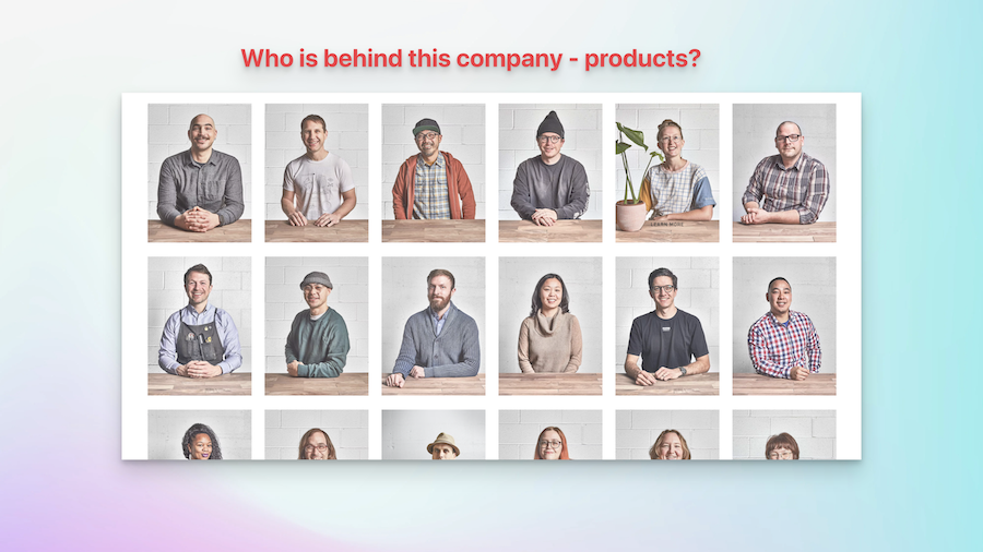
Team
A section where you get to meet the people who make the product or service.
Tips
Useful tips to improve the quality of your landing page.
- Include photos and short bios of team members to create a personal connection with your audience.
Should I add a Team section?
Yes, you should include it if you are building a landing page
Team Section Examples
Grovemade
-
Grovemade Hero Component & Section
Grovemade landing page example

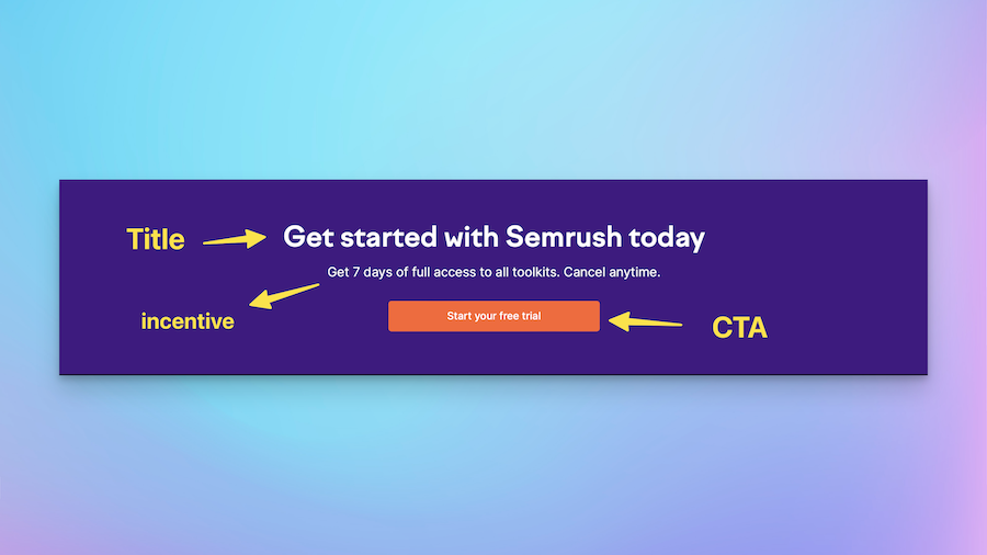
Call to Action
The part of a website that asks you to do something, like sign up, buy something, or learn more.
Tips
Useful tips to improve the quality of your landing page.
- Make the CTA button highly visible, with a contrasting color that stands out from the rest of the page.
Should I add a Call to Action section?
Yes, you should include it if you are building a landing page
Call to Action Section Examples
Semrush
-
Semrush Hero Component & Section
Semrush landing page example

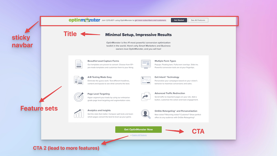
Features
This part of a website lists and explains all the cool things the product or service can do.
Tips
Useful tips to improve the quality of your landing page.
- Prioritize and highlight the most important features that align with your target audience's needs.
Should I add a Features section?
Yes, you should include it if you are building a landing page
Features Section Examples
Optinmonster
-
Optinmonster Hero Component & Section
Optinmonster landing page example

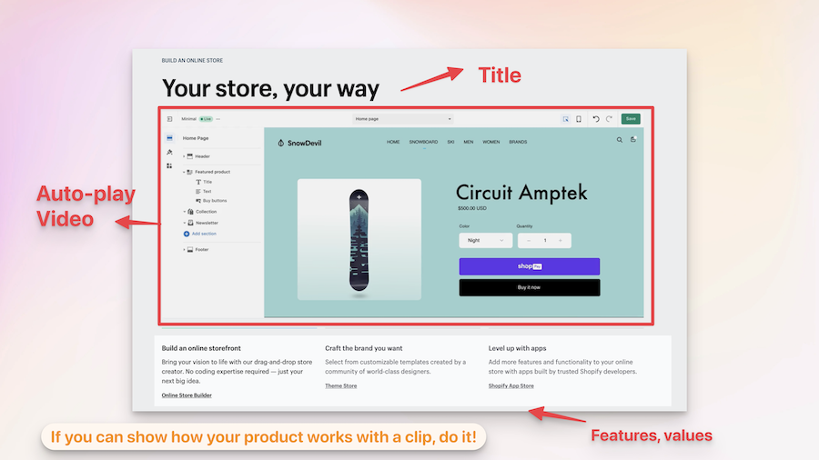
How it Works
This part of a website explains step-by-step how the product or service works.
Tips
Useful tips to improve the quality of your landing page.
- Present the steps in a logical order and use simple language to make it easy for visitors to follow.
Should I add a How it Works section?
XXX Component
How it Works Section Examples
Shopify
-
Shopify Hero Component & Section
Shopify landing page example

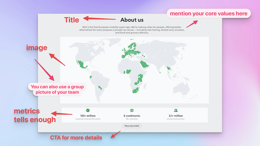
About Us
This section tells the story of the company and what it stands for.
Tips
Useful tips to improve the quality of your landing page.
- Share your brand's story in a compelling and relatable way that resonates with your target audience.
Should I add a About Us section?
Yes, you should include it if you are building a landing page
About Us Section Examples
Bolt
-
Bolt Hero Component & Section
Bolt landing page example

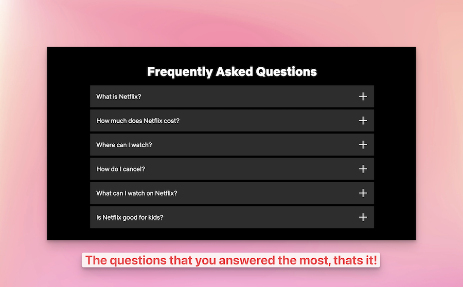
FAQ
A section where common questions about the product or service are answered.
Tips
Useful tips to improve the quality of your landing page.
- Keep the answers concise and to the point, avoiding long paragraphs
Should I add a FAQ section?
Yes, you should include it if you are building a landing page
FAQ Section Examples
Netflix
-
Netflix Hero Component & Section
Netflix landing page example

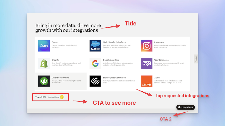
Integrations
This section shows other products or services that work well with the product or service.
Tips
Useful tips to improve the quality of your landing page.
- Highlight the most popular or relevant integrations first to capture visitors' attention quickly.
Should I add a Integrations section?
XXX Component
Integrations Section Examples
Mailchimp
-
Mailchimp Hero Component & Section
Mailchimp landing page example

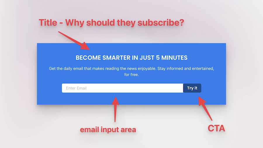
Newsletter
This part of the website invites you to sign up to get emails from the company.
Tips
Useful tips to improve the quality of your landing page.
- Offer a clear value proposition for subscribing, such as exclusive content, discounts, or early access to updates.
Should I add a Newsletter section?
Yes, you should include it if you are building a landing page
Newsletter Section Examples
Morning Brew
-
Morning Brew Hero Component & Section
Morning Brew landing page example

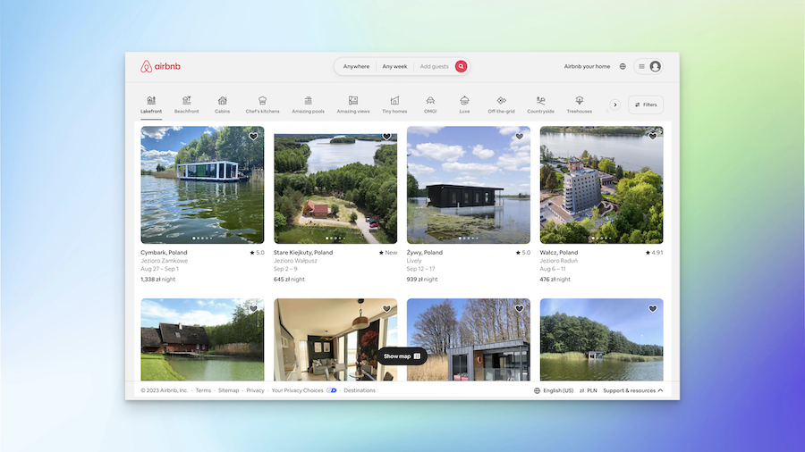
Portfolio
This section shows examples of the work the company has done.
Tips
Useful tips to improve the quality of your landing page.
- Showcase a diverse range of projects to demonstrate the versatility and capabilities of your product or service.
Should I add a Portfolio section?
Yes, you should include it if you are building a landing page
Portfolio Section Examples
Airbnb
-
Airbnb Hero Component & Section
Airbnb landing page example

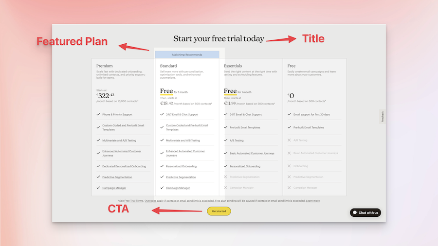
Pricing
This section explains how much the product or service costs.
Tips
Useful tips to improve the quality of your landing page.
- Consider offering different pricing tiers or plans to cater to various customer needs and budgets.
Should I add a Pricing section?
Yes, you should include it if you are building a landing page
Pricing Section Examples
Mailchimp
-
Mailchimp Hero Component & Section
Mailchimp landing page example

Comparison
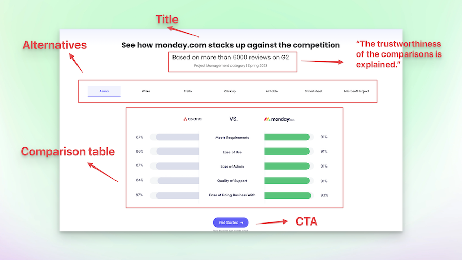
This section shows how the product or service is better than others like it.
Tips
Useful tips to improve the quality of your landing page.
- Use visual elements, like tables or charts, to make the comparison easy to understand at a glance.
Should I add a Comparison section?
Comparison Component
Comparison Section Examples
Monday
-
Monday Hero Component & Section
Monday landing page example

Contact
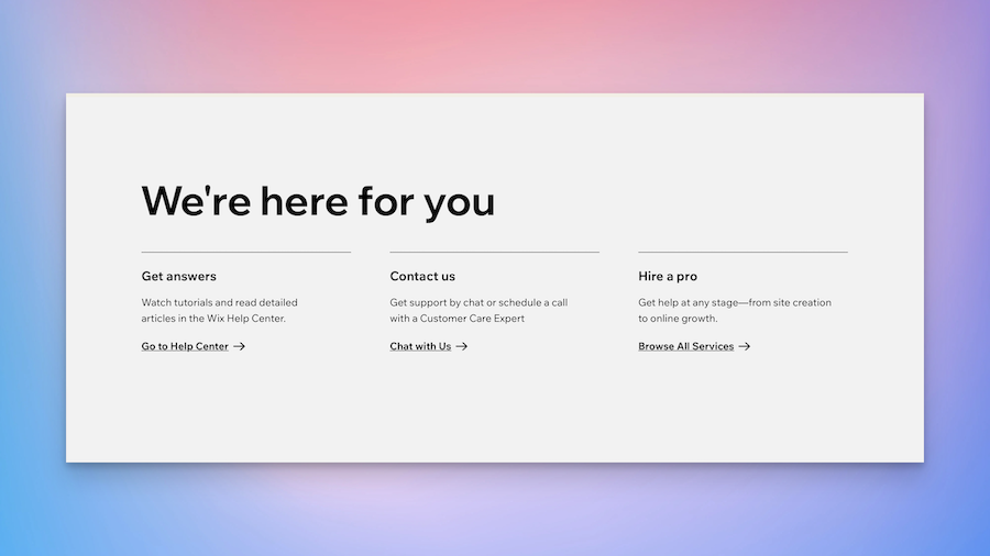
This part of the website tells you how to get in touch with the company.
Tips
Useful tips to improve the quality of your landing page.
- Provide multiple contact options (email, phone, live chat) to accommodate visitors' preferences.
Should I add a Contact section?
Yes, you should include it if you are building a landing page
Contact Section Examples
Wix
-
Wix Hero Component & Section
Wix landing page example

Careers
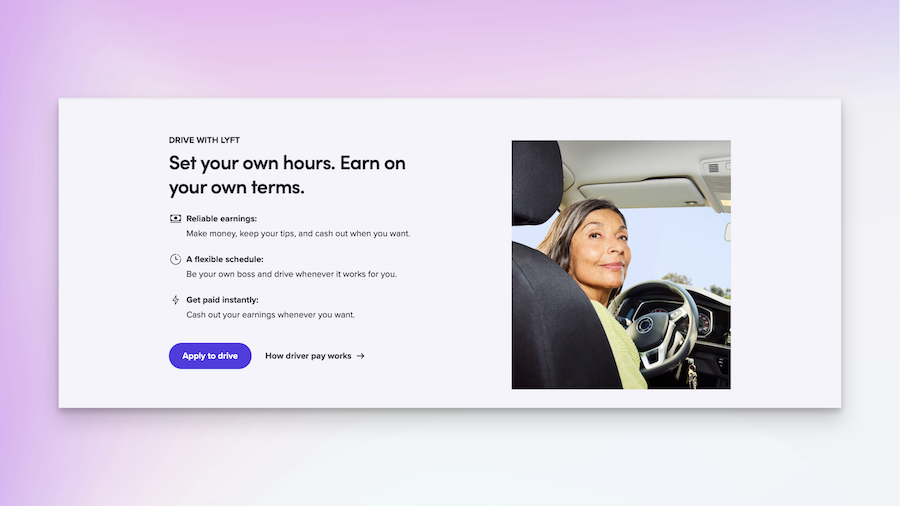
This section shows job opportunities at the company.
Tips
Useful tips to improve the quality of your landing page.
- Clearly list the available job openings and their requirements to attract the right candidates.
Should I add a Careers section?
Yes, you should include it if you are building a landing page
Careers Section Examples
Lyft
-
Lyft Hero Component & Section
Lyft landing page example

Blog
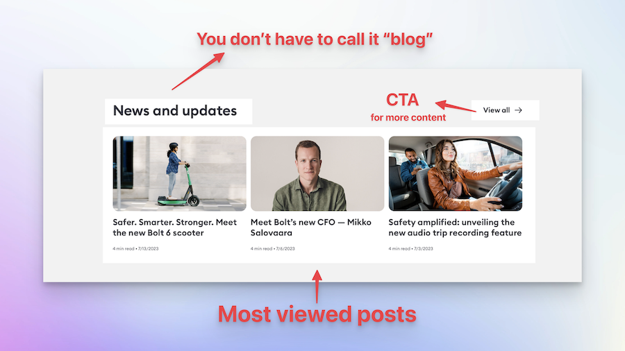
This part of the website has articles and stories about the company and its industry.
Tips
Useful tips to improve the quality of your landing page.
- Regularly update the blog with fresh and relevant content to keep visitors engaged and coming back.
Should I add a Blog section?
Yes, you should include it if you are building a landing page
Blog Section Examples
Bolt
-
Bolt Hero Component & Section
Bolt landing page example

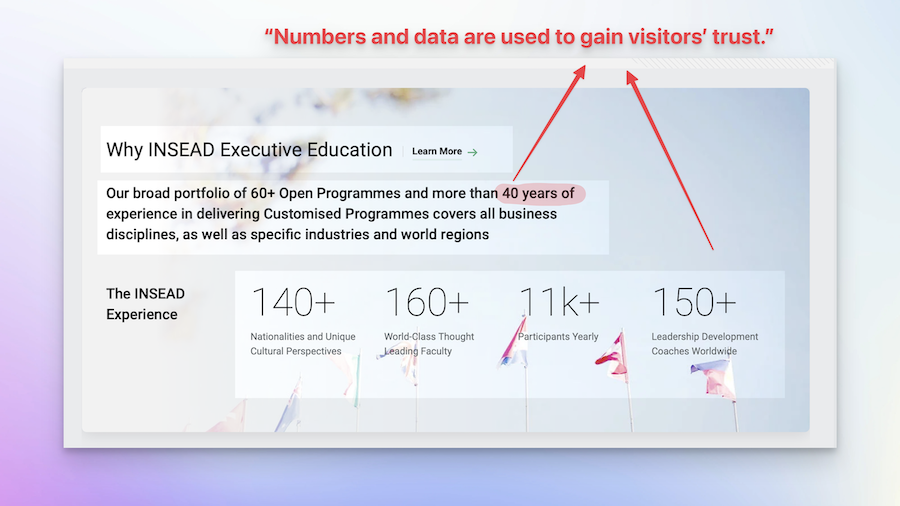
Stats
This part of the website shows numbers and data that help explain the impact of the product or service.
Tips
Useful tips to improve the quality of your landing page.
- Regularly update the stats to keep the information accurate and relevant
Should I add a Stats section?
Yes, you should include it if you are building a landing page
Stats Section Examples
Insead
-
Insead Hero Component & Section
Insead landing page example

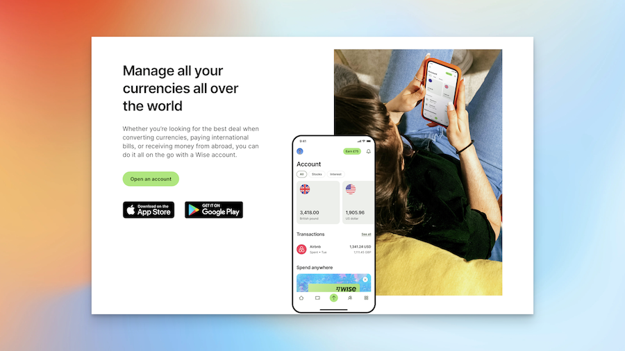
Application
This section allows you to apply for something, like a job or a service.
Tips
Useful tips to improve the quality of your landing page.
- Use action-oriented language that encourages visitors to take the desired action, such as *Get Started* or *Join Now*.
Should I add a Application section?
Yes, you should include it if you are building a landing page
Application Section Examples
Wise
-
Wise Hero Component & Section
Wise landing page example

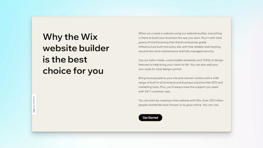
Why choose us, Incentives
This section tells you all the special things the company offers that make them the best choice.
Tips
Useful tips to improve the quality of your landing page.
- Focus on the unique benefits and features that genuinely set your product or service apart from competitors.
Should I add a Why choose us, Incentives section?
Yes, you should include it if you are building a landing page
Why choose us, Incentives Section Examples
Wix
-
Wix Hero Component & Section
Wix landing page example

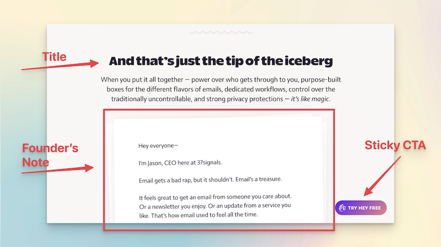
Founder's Note
A message from the person who started the company, talking about why they made the product or service and why they think you'll like it.
Tips
Useful tips to improve the quality of your landing page.
- Write the founder's note in a conversational and relatable tone to connect with visitors on a personal level.
Should I add a Founder's Note section?
Yes, you should include it if you are building a landing page
Founder's Note Section Examples
Hey
-
Hey Hero Component & Section
Hey landing page example

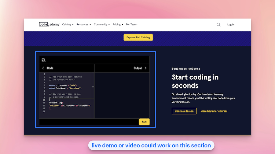
Demo
This part of a website lets you try out their product or service for a little while.
Tips
Useful tips to improve the quality of your landing page.
- Include a clear call to action after the demo to encourage visitors to take the next step, such as signing up for a free trial
Should I add a Demo section?
Demo Component
Demo Section Examples
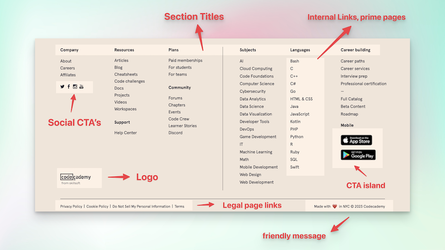
codeacademy
-
codeacademy Hero Component & Section
codeacademy landing page example

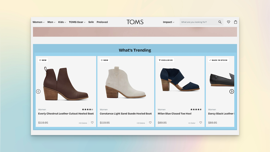
Showcase
This part of a website shows what the company's planning to do next, like the new things they're going to make or the improvements they're going to do.
Tips
Useful tips to improve the quality of your landing page.
- Include case studies or success stories to provide more in-depth insights into how your offerings have benefited clients.
Should I add a Showcase section?
Yes, you should include it if you are building a landing page
Showcase Section Examples
Toms
-
Toms Hero Component & Section
Toms landing page example


Sneak Peek
This is where the company shows off all the cool things people have made or done using their product.
Tips
Useful tips to improve the quality of your landing page.
- Create a sense of intrigue without revealing too much, leaving visitors curious and excited for the upcoming release
Should I add a Sneak Peek section?
Yes, you should include it if you are building a landing page
Sneak Peek Section Examples
Atomic Habits
-
Atomic Habits Hero Component & Section
Atomic Habits landing page example

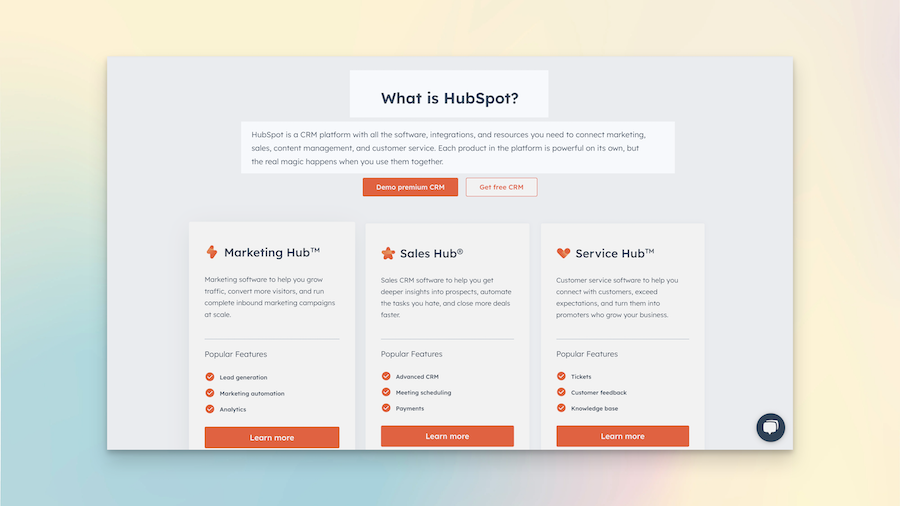
What is it?
This section tells you what the product or service is and what it does.
Tips
Useful tips to improve the quality of your landing page.
- Use clear and straightforward language to explain what your product or service does, avoiding industry jargon.
Should I add a What is it? section?
Yes, you should include it if you are building a landing page
What is it? Section Examples
Hubspot
-
Hubspot Hero Component & Section
Hubspot landing page example

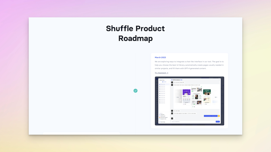
Roadmap
This part of a website shows what the company's planning to do next, like the new things they're going to make or the improvements they're going to do.
Tips
Useful tips to improve the quality of your landing page.
- Be realistic and transparent about the timeline for upcoming features or improvements.
Should I add a Roadmap section?
Yes, you should include it if you are building a landing page
Roadmap Section Examples
Shuffle
-
Shuffle Hero Component & Section
Shuffle landing page example

This page is still built in progress ⚠️
Please come back later or leave your email address. You'll be the first to know when it's available.
What is a Hero Section in a Landing Page?
The Hero section is the first big section of a website, introducing what the site is about, similar to a book cover.
How Important is Social Proof for Landing Pages?
Social Proof sections are essential for building credibility and trust with new visitors.
Why Include a Value & Product Section?
The Value & Product section details the benefits and unique selling points of your product or service.
